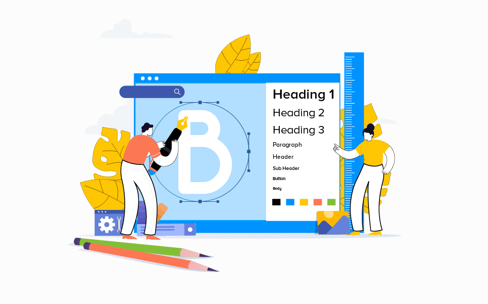
Typography in UI Design: Choosing Fonts that Enhance User Engagement
Typography plays a crucial role in user interface (UI) design, influencing how users perceive, interact with, and navigate through digital products. Beyond aesthetics, the choice of fonts significantly impacts readability, accessibility, and overall user experience. This comprehensive guide delves into the importance of typography in UI design, explores key considerations for selecting fonts, discusses best practices, and highlights the transformative impact of typography on user engagement and satisfaction.
Importance of Typography in UI Design
Typography encompasses the selection, arrangement, and appearance of text elements within a digital interface. It serves as a fundamental component of visual communication, conveying information, establishing hierarchy, and guiding user interactions. Effective typography enhances usability by making content more accessible, readable, and engaging for users across different devices and screen sizes.
Key Considerations for Selecting Fonts
- Readability and Legibility:
- Choose fonts that are easy to read and comprehend, especially for longer blocks of text.
- Consider factors such as x-height, letter spacing (tracking), and line height (leading) to optimize readability.
- Brand Alignment:
- Select fonts that align with the brand's personality, values, and visual identity.
- Ensure consistency in font usage across all brand touchpoints to reinforce brand recognition and coherence.
- Hierarchy and Emphasis:
- Use different font weights, styles (such as bold or italic), and sizes to create visual hierarchy and emphasize important information.
- Establish clear distinctions between headings, subheadings, body text, and calls-to-action to guide users through content.
- Accessibility and Inclusivity:
- Prioritize accessibility by choosing fonts that are legible for users with visual impairments or reading disabilities.
- Consider contrast ratios between text and background colors to ensure readability and meet accessibility standards.
- Responsive Design Considerations:
- Select fonts that scale well across different devices and screen resolutions.
- Opt for web-safe fonts or utilize web font services (such as Google Fonts or Adobe Fonts) that support responsive design and load efficiently.
Best Practices for Typography in UI Design
- Limit Font Choices:
- Avoid using too many fonts within a single interface to maintain visual consistency and clarity.
- Typically, 2-3 fonts (including variations in weight and style) are sufficient for establishing hierarchy and visual interest.
- Pairing Fonts Effectively:
- Choose font pairings that complement each other while creating contrast in style and function.
- Pair serif and sans-serif fonts for distinct hierarchy (e.g., sans-serif for headings and serif for body text) or use variations within the same font family for consistency.
- Whitespace and Layout:
- Utilize whitespace (negative space) effectively around text elements to improve readability and visual appeal.
- Ensure adequate margins, padding, and line spacing to prevent text from feeling cramped or overwhelming.
- Usability Testing and Iteration:
- Conduct usability tests to evaluate the readability and usability of selected fonts with target users.
- Iterate on font choices based on feedback and usability findings to optimize user experience.
Impact of Typography on User Engagement
- Enhanced Readability: Clear and well-chosen typography reduces cognitive load and enhances content comprehension, encouraging users to engage with the interface.
- Brand Perception: Consistent and appropriate typography reinforces brand identity and professionalism, influencing how users perceive the product and brand.
- Visual Appeal: Thoughtful typography creates a visually appealing interface that attracts and retains user attention, driving engagement and interaction.
- Accessibility Compliance: Accessible typography ensures inclusivity, accommodating diverse user needs and preferences for a seamless user experience.
Case Studies and Examples
Illustrate the application of effective typography in UI design through case studies of successful digital products or interfaces. Showcase how typography choices have contributed to improved user engagement, readability, and overall usability, emphasizing measurable outcomes and user feedback.
Typography in UI design is not merely a decorative element but a strategic tool for enhancing user engagement, readability, and overall user experience. By prioritizing considerations such as readability, brand alignment, accessibility, and responsive design, designers can leverage typography to create intuitive and visually compelling interfaces that resonate with users. As technology evolves and user expectations continue to evolve, mastering typography principles and best practices remains essential for designing impactful digital experiences that captivate and delight users across diverse platforms and devices. Embrace the power of typography to elevate your UI designs, foster user engagement, and achieve design excellence in the competitive landscape of digital products.


